ROBOOST brand identity
An interactive version of the guidelines: logo, typography, colors, pattern, triangular shape and corporate materials.

Logo
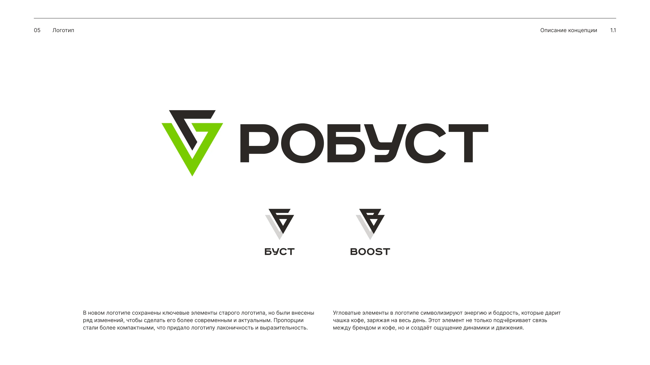
The mark is constructed from two equilateral triangles. The color version of the logo is the primary one; alternate versions are used where full color cannot be reproduced or where they read better.
Clear space is the minimum distance to surrounding objects that keeps the logo legible and recognizable. It is built on the X module from the construction scheme.
Use
- checkThe color version is the primary one
- checkB/w versions on busy backgrounds and photos
- checkWatch the contrast between logo and background
Never
- closeDisproportionate scaling
- closeRecoloring logo elements
- closeRecomposing the logo
- closeInsufficient contrast with the background
- closeChanging the typeface
- closeAdding shadows and effects
Vector files
SVG in brand colors — grab them right here. Monochrome versions are in the archive.





Typography
RoadRadio is for headlines and subheads; the logo uses the Bold weight. Inter is for body text: it stays readable at any size and supports multiple languages.
Ваш идеальный кофе
Попробуйте вкус, который вдохновляет!
Кофе: напиток, который вдохновляет
Кофе — это не просто напиток, это целый мир вкусов и ароматов. Он способен пробудить чувства, зарядить энергией и подарить моменты наслаждения.
Type samples are taken verbatim from the Russian brandbook (pp. 2.2 and 2.4).
Palette
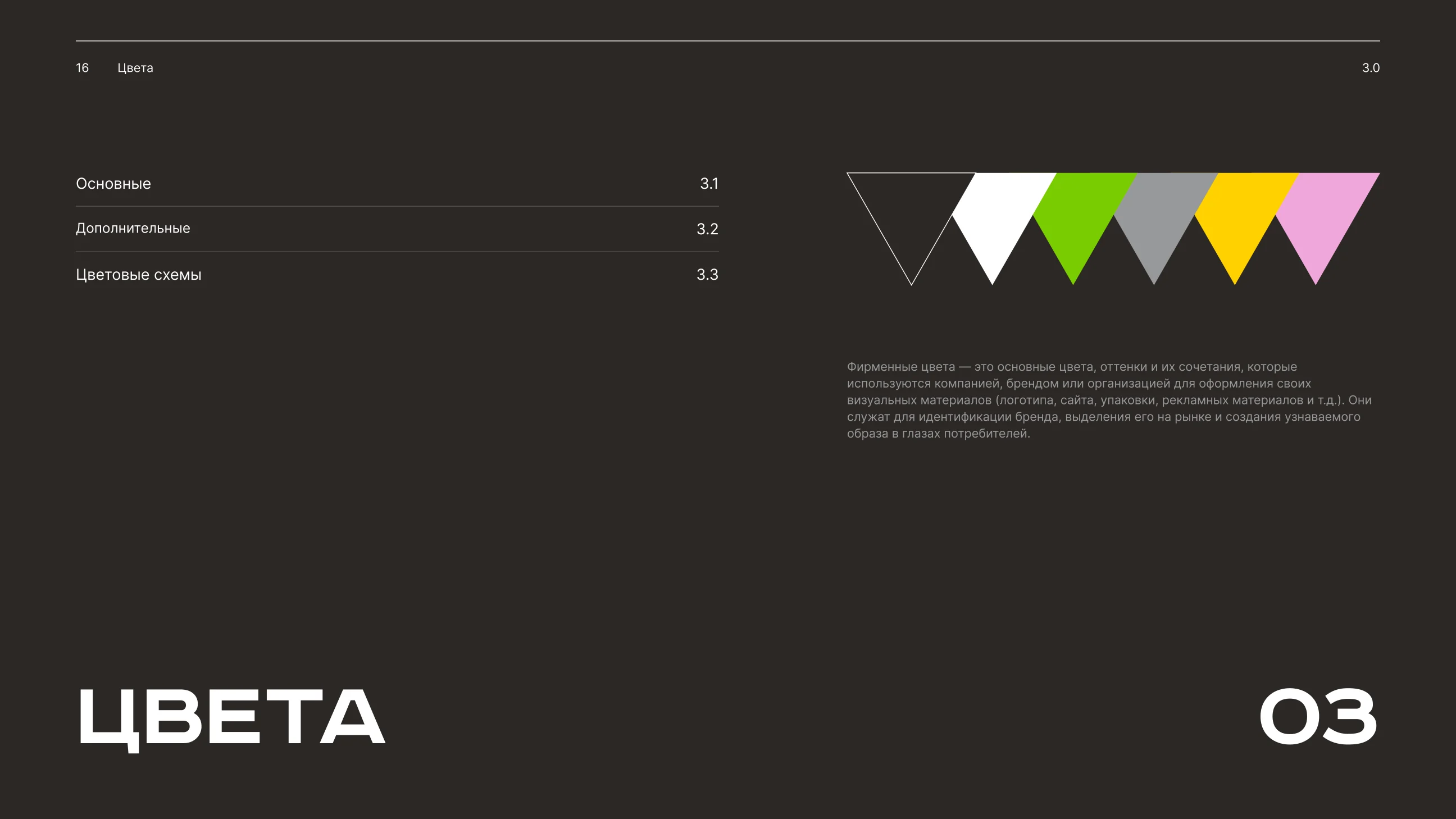
The primary colors are white, black and green. Gray, yellow and pink are supporting. The layer order in color schemes is fixed: background and graphics never swap places.
Pattern & Shape
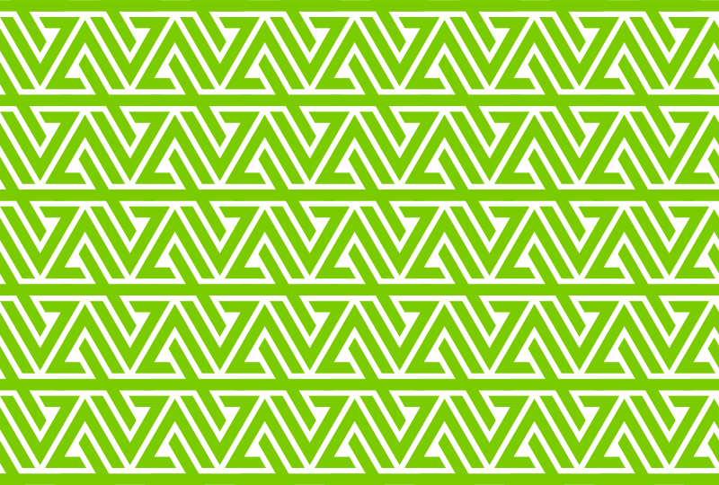
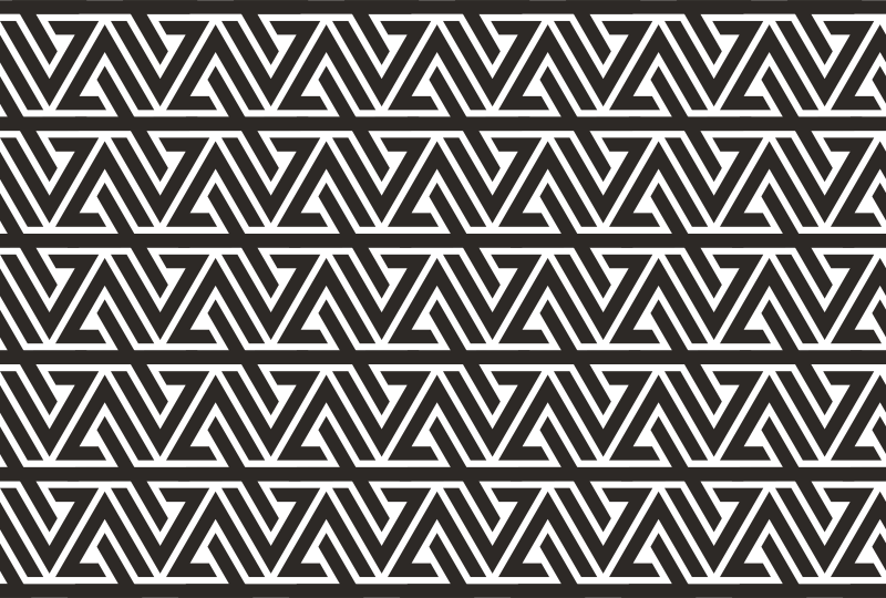
The pattern is built from the repeating brand mark. It can run as a single line — for example, framing a coffee cup — or be multiplied into several lines for extra dynamics.
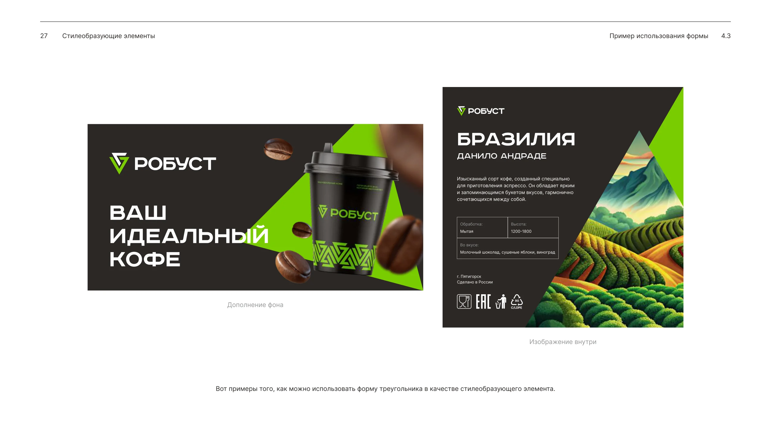
The triangle is a style-forming shape: a background or an image container


Brand in Use
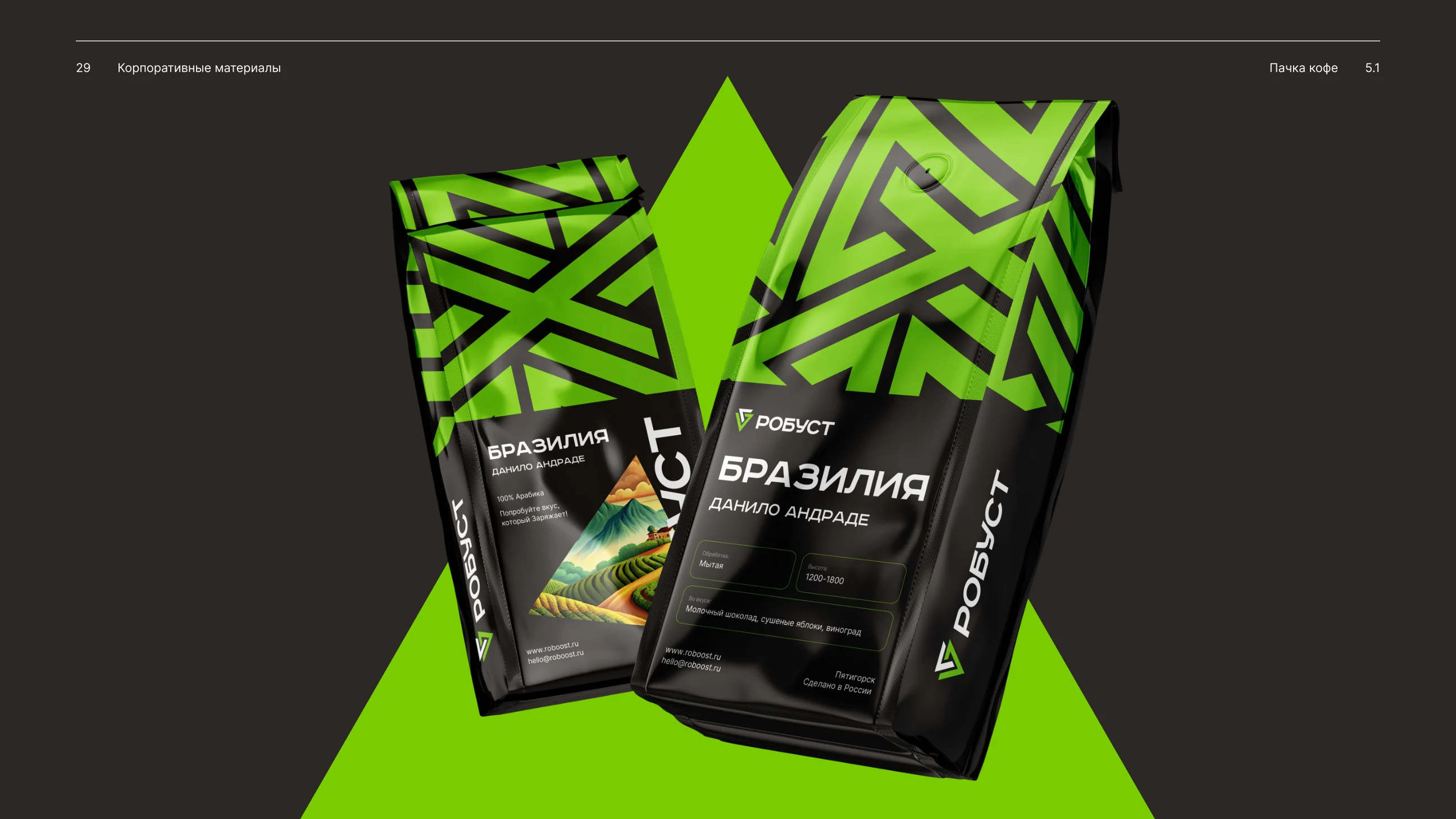
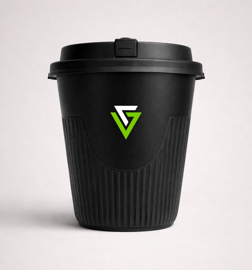
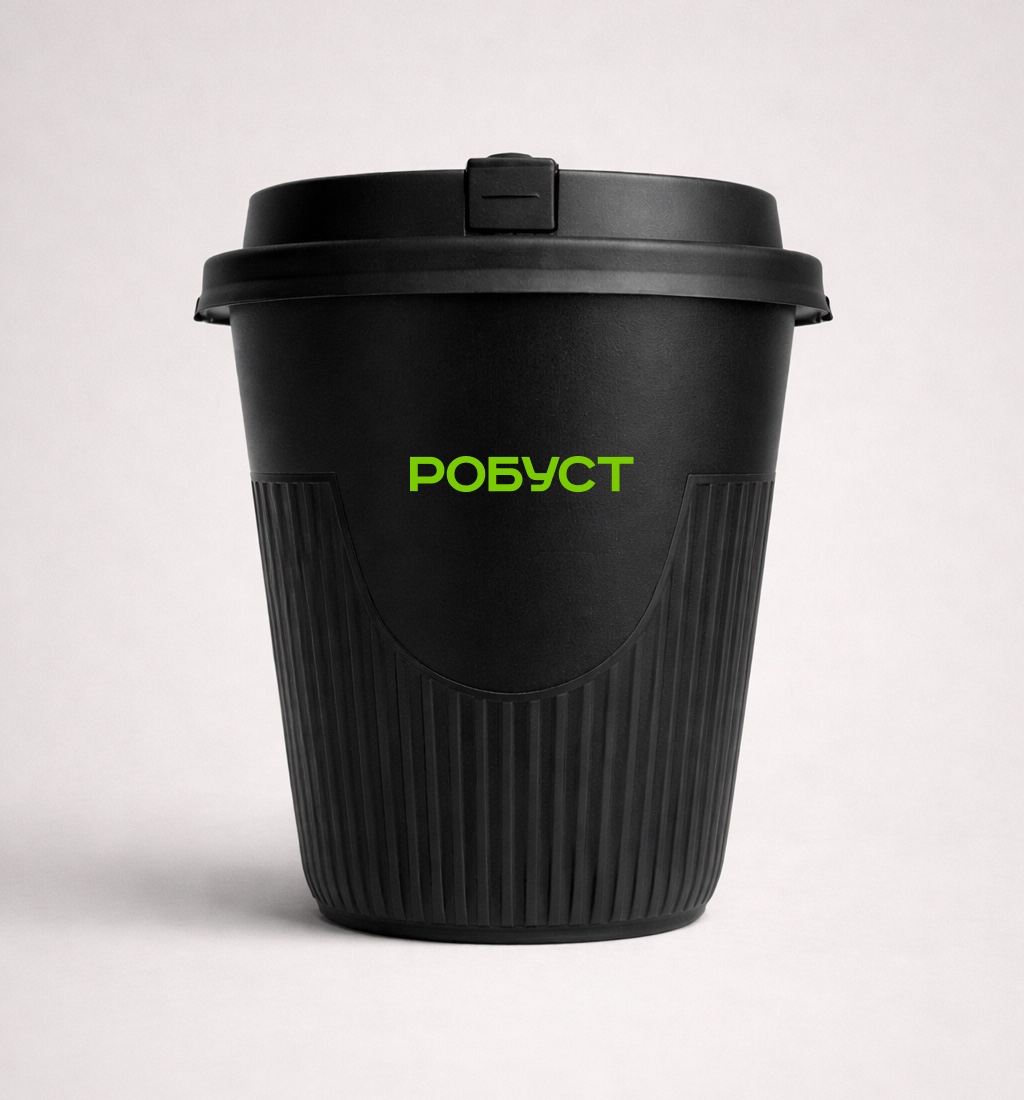
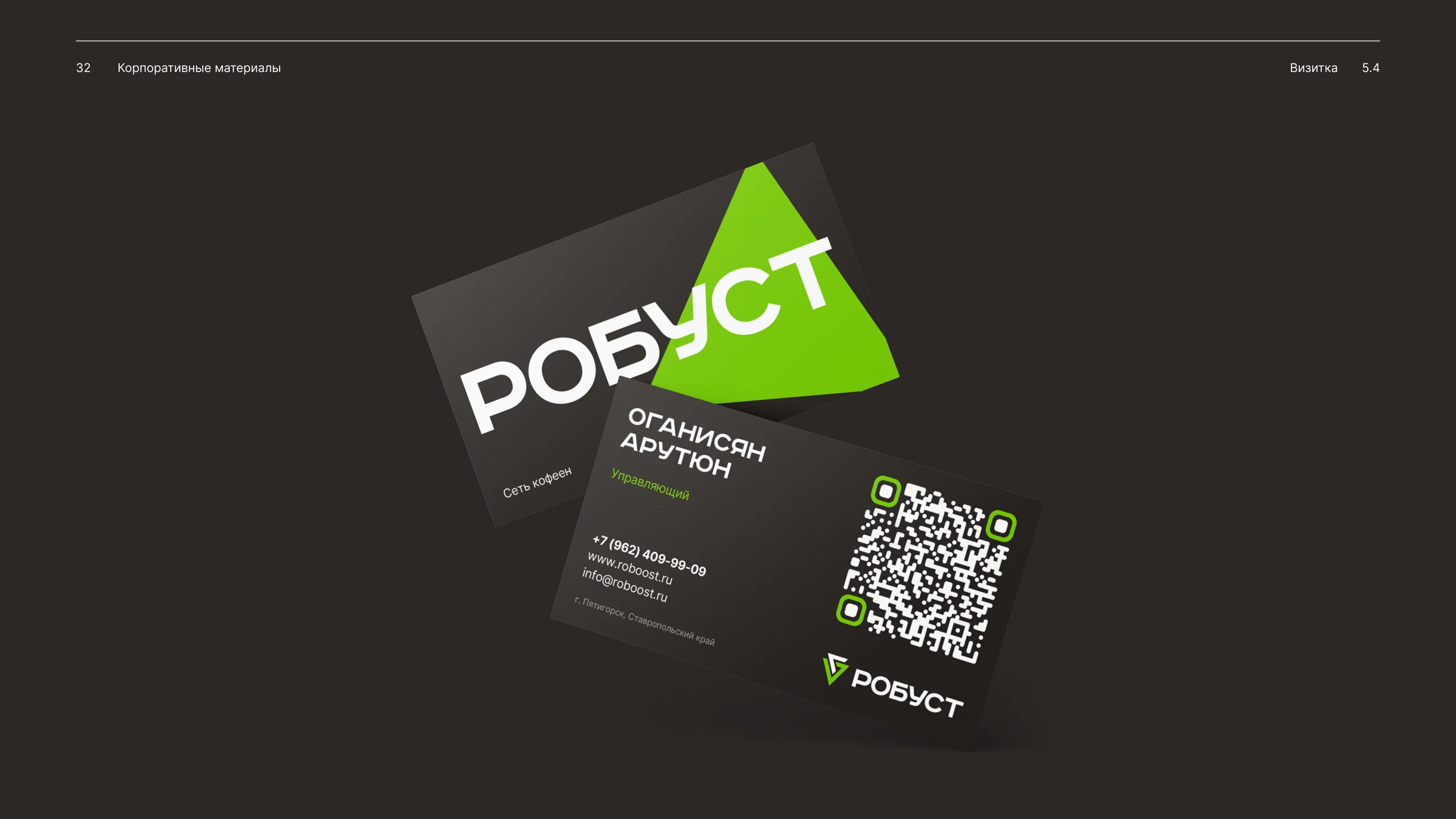
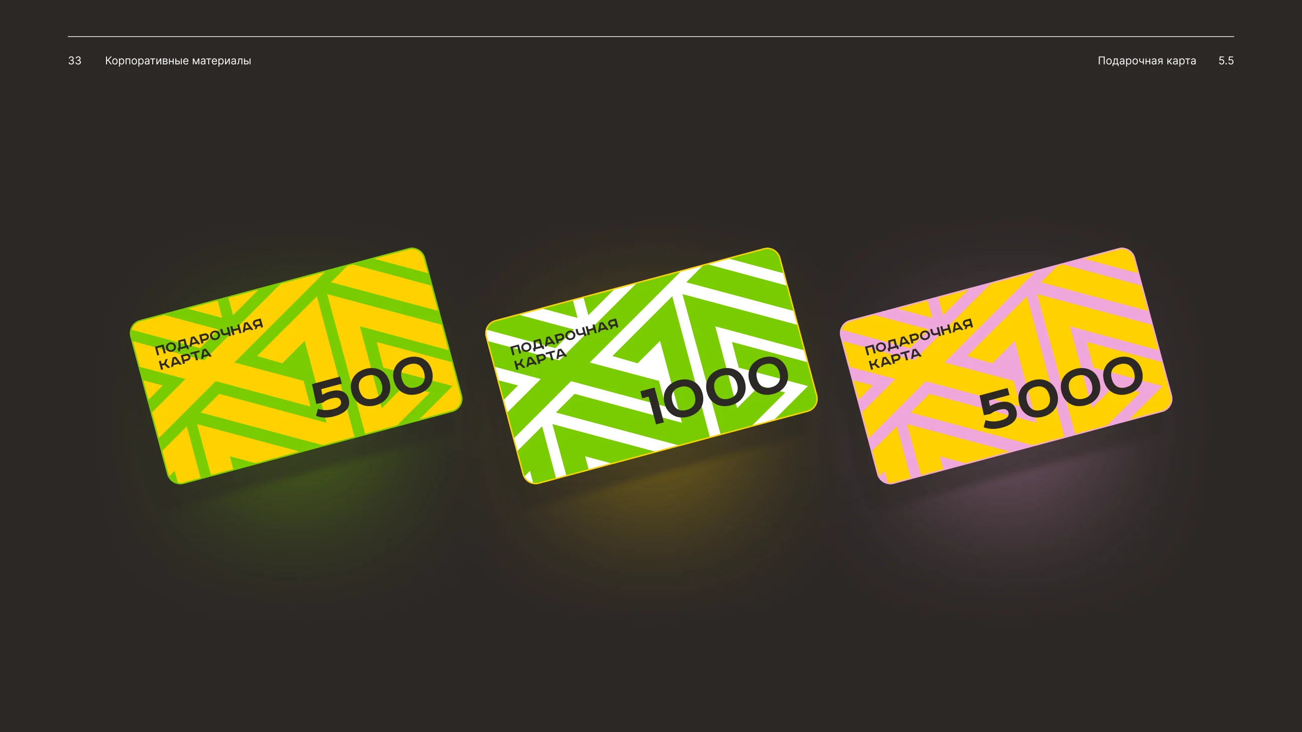
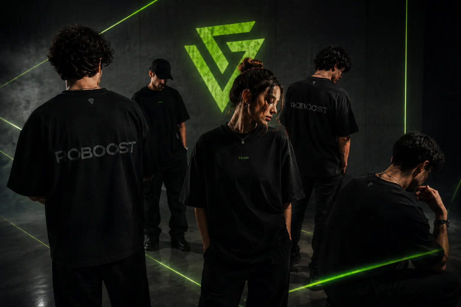
The system scales across coffee packs, cups, business cards, gift cards and team apparel.